Power BI is always trying to make it easier for anyone to start analyzing their data. That is why they are constantly producing new AI tools that are supposed to help you gain insight into your data. In this blog I picked 5 of these to see if they do make data analysis easier.
This first visual was developed to check which factors influence a particular outcome. In this example I want to know what influences product returns to be able to minimize the amount of returns.
To try it out the visual I set it up as broadly as I could. I added all the features I could to the “explain by” field. These were things like discounts, store type, price, ect. I recommend you add as many variables as possible. You never know what insights you might come to. In this case Power BI tells me that the sales quantity is a key influencer when it comes to returns.
On the first part of the visual, Power BI gives you an overview of all the factors that make returns more probable and by how much the likelihood of a return increases. In this example returns would be 7 times more likely for sales quantities between 78 and 96 units. On the second part of the visual the category “sales quantity 78-96” gets compared to the other categories. Here you can tell that the return rate of this category is way higher than the average return rate of the other categories. (These categories were made automatically by Power BI)
There is however something you really need to keep an eye out for. In this example there are only 378 instances where the sales quantity is between 78 and 96. All other categories have 10’s to 100 thousand instances. This means the category isn’t representative since there aren’t enough instances. Therefore, this first insight is probably negligible.
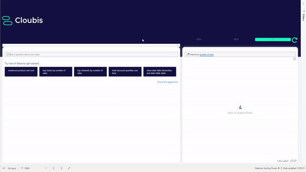
The second functionality I will discuss is the Q&A function. It allows you to create visuals by asking a question. Power BI will help you by suggesting questions or columns while you are typing. There are two ways to use Q&A:
Just like any other visual, you can add a Q&A box to your report. This way users can make visuals they find are missing or that don’t get used enough to add.
When you ask a question, Power BI will always try to choose the best kind of graph for that question. But if you have something else in mind, or you want to quickly try out different kinds of graphs you can pick your own graph by adding it to your question. This is how I choose to show sales amount per country on a map instead of on a bar chart.
A second way to use Q&A is to go to the insert tab in the ribbon and clicking on Q&A. You can ask questions in the exact same way, when you are satisfied with your result you will be able to turn it into a standard visual and add it to any report or dashboard.
Q&A works well if you want to make simple visuals like bar charts, but I do not recommend it if you are trying to visualize a more complex question. In that case you would be better off making the visual yourself.
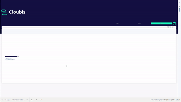
This third visual is ideal if you want to visualize things like where your revenue comes from on different levels. For example, level 1 would be sales amount per region. Level 2, sales amount per region per shop. Level 3, sales amount per shop per product category, and so on. Another way to use it would be to visualize conversion funnels or hierarchies.
In itself the decomposition tree might not seem like an AI visual, but that depends on how you use it. One way to use it is to choose the order in which you show the different levels yourself. The other way to use it is to leave the order (partially) up to Power BI. When clicking on the plus symbol to add a level you get the option to choose highest or lowest value. If you choose highest, Power BI will add the level with the highest sales amount. In this case that is the region. If you choose lowest value, Power BI will add the level with the lowest sales amount. In this case that is the product level. This could be useful to quickly find out what products or categories are underperforming and why.
This fourth functionality is still in preview mode. You will have to turn it on in settings if you want to try it out for yourself. If you do this, you will be able to find it under analysis when you create a line chart.
What anomaly detection does is basically looking for outliers. Power BI will ask you to select a certain sensitivity, this determines an interval around the value that power BI expects. If the actual value is higher or lower than the expected interval it will be marked as an outlier.
Detecting outliers is not that new or exciting, but what makes this special is that Power BI will try to explain why this outlier occurred. When you click on an outlier you will see that Power BI made an analysis of different factors that could have contributed to the outlier.
In this example we have an outlier of the sales quantity on 4/08, the explanation tells us that the sales in European cities was higher than expected that day, maybe there was a sale in Europe. The fact that Power BI tries to explain the outliers makes your job easier since you don’t have to start looking trough all your data to try and find out why tour sales are so much higher that day. Power BI will probably guide you in the right direction.

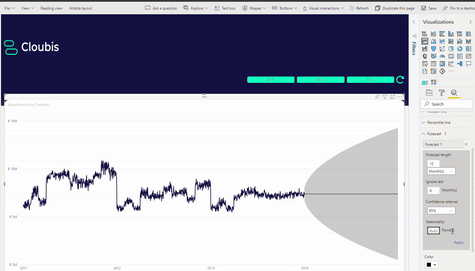
The last functionality I wanted to check out was the forecast. Just like anomaly detection you can turn it on in the analytics tab when making a line chart. In this example I want to forecast the sales for the next year, so the forecast length is set to 12 months. In this case I set the confidence interval to 95%, this means I can be 95% sure that the actual sales will be in the interval Power BI provides.
If you don’t change anything else, you will notice that Power BI just draws a horizontal line with the grey interval around it. The true power of the forecast lies in seasonality. Some products, like sunscreen, have really obvious seasonality. Sunscreen sells way better in summer and around the winter holidays when people go skiing. This means that the seasonality of sunscreen is 1 year. Other products might sell better in the beginning of the month when people just got their paycheck, those products have seasonality over one month. When looking at my graph you can tell that there is a clear pattern that repeats itself every year. Since every datapoint on the graph represents one day the seasonality on this graph is 365 points. Now you can see that Power BI repeated this pattern for the next year, it also picked up on the downward trend over the years.
The big downfall of this functionality is of course not having or knowing what the seasonality is. In my case it was quite obvious but that definitely won’t always be the case.
To conclude, all these AI functionalities are a good way to help you get started on your analysis. But it is important to check the analysis Power BI makes, like in the key influencers example. The insight Power BI gives you should only be a first step to a deeper analysis of your data, to find out if the really is a correlation between sales amount and returns and to find out the cause of this correlation.