This blog is part 4 in our miniseries on real-time data analytics using Flanders’ traffic data.
In part one we showed you how to perform real-time data processing, in part four we will show you how to get this data into power BI and how to make real-time dashboards. Just like in part one we will demonstrate this using Flanders’ traffic data. These real-time dashboards will make sure you are always up to date with what’s going on right now and will therefore allow you to continuously make small changes that will make a real impact. Some common use cases are:
There are different ways to bring data into Power BI and it’s possible to achieve a real-time or near real-time view with all of them.
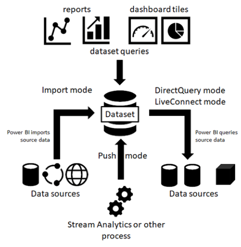
First let’s have a look at the different types of datasets, if you’re familiar with Power BI you should probably already know these. Basically, there are two main categories. Pull datasets and Real-time datasets.
You can think of pull datasets as data that is pulled into the Power BI Service. In other words, Power BI is the one retrieving data from the source. This includes:

On the other hand, data from real-time datasets is pushed into Power BI. Meaning Power BI isn’t the one getting the data, but the dataset is the one pushing the data into the Power BI Service via the Power BI Rest API connection. We can make a distinction between:
When you create a Push or a Hybrid dataset the data will be stored in an Azure SQL database.
A pure Push dataset gives you quite a bit of flexibility. As soon as you add data into the table, you can access the dataset from Power BI Desktop and all the report designer options will be available. You can create measures in DAX, choose a visual of your choice and apply filtering.
The streaming dataset is stored into a temporary cache (up to an hour). This option is more restrictive since you can only use it with the streaming data tiles. This means there are no rich data modelling options and you cannot use the report designer, create measures or use filters.
PubNub is an external site with it’s own streaming network. When you connect Power Bi to PubNub no data will be stored in Power BI, but you are directely connected to the PubNub stream. You will only be able to use streaming tiles just like with streaming datasets.
The Hybrid dataset combines push and streaming. It will store data into a temporary cache (up to an hour) as well as into the Azure SQL database (up to 200.000 rows). This means you can create streaming data tiles in the dashboard as well as report designer visuals. You can apply filters to the visual which will be kept up to date when you pin the visual to the dashboard. You will also be able to open the dataset from Power BI Desktop. However, the possibilities are more restricted than with the Push dataset.
This matrix gives an overview of the capabilities and limitations of the different dataset types.

Further limitations to take into consideration are the Power Bi REST API limitations.
Most of them are pretty straightforward but I want to clarify the difference between the FIFO dataset and the ‘none retention policy’ dataset. The API option with historical data analysis enabled uses the FIFO model (First In First Out). When your limit of around 200.000 rows is reached the oldest rows will be removed.

When you enable ‘non retention policy’ on your dataset, the row limit increases to 5.000.000 rows, which sounds interesting. But keep in mind that as soon as the table is full, you will not be able to add any more records. The only way to fix this is by removing all rows from the table and starting over. Which of course means you lose all your “historical” data and not just the oldest rows.
Now that we got that out of the way, it’s time to build on the data flow we created last time in AWS Kinesis Data Analytics. In this case we will explore the hybrid dataset via the API option of the Power BI Service, but don’t hesitate to explore and try out all the other options as they might be more suitable for your application. If you made the data processing flow in Azure you can easily create a connection with Power BI since you can connect Azure Stream Analytics to power BI.
We will use a real-time dataset based on Flanders’ traffic that’s pushed through Kinesis Data Analytics. You can find the details on how this was set up in part1.
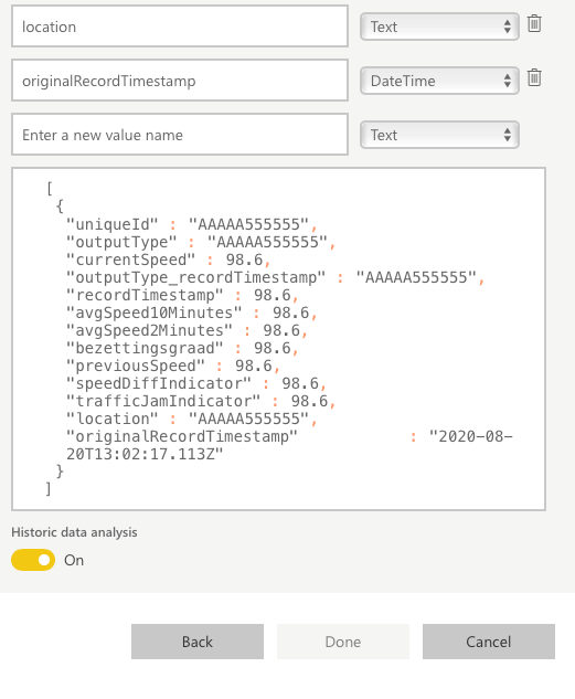
To get started, go to the Power BI Workspace. You’ll want to choose the Streaming dataset from the Create menu. As mentioned before, we are connecting through the API option. Make sure that the names and field types correspond to those that will be pushed through the API. The most important bit here is the historic data analysis toggle, this will determine if it’s a streaming set (toggle off) or a hybrid dataset (toggle on). You should be all set; your new real-time dataset will now be available for you to use.
If you connected Power BI to your Azure stream this configuration will be pushed through automatically, so if you make changes in Azure these changes will also be pushed through to Power BI.
Let’s take a look at the streaming tiles first, these tiles will continuously take the streaming data from the cache. They are specifically made for streaming data, so they are optimized to show smooth animations when new data is available. However, your visuals will only be able to display data from maximum one hour ago. Streaming data gets removed from the cache after one hour so you can’t set longer intervals for streaming data tiles. The options are quite limited, but they do allow you to get an accurate view of the current situation. You can add these tiles:

Now let’s see what’s possible for our hybrid dataset. When you create a report for this dataset you will be able to choose from all the usual power BI tiles. If you want visuals to just show the most current data, you can always use a filter to only show the top few rows.
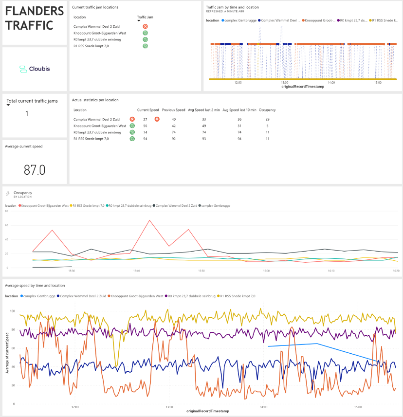
We set up a few examples that were made specifically for our traffic data. In this case it would be very useful if we could have an overview of the current situation for a few key locations in Flanders. We added some conditional formatting to this table to be able to pinpoint traffic jams and traffic jams that are forming. For this visual, the location field has conditional formatting applied based on the trafficJamIndicator field. The Current Speed field has some rules applied based on the Occupancy field.

The line chart below shows the evolution of traffic jams per location. We have applied a relative time filter limited to the last 240 minutes. With the formatting pane, the Y-axis is turned off, the data colors are changed, and the shapes are changed. This visual shows us where traffic jams formed, at what time and when they dissolved.
When you’re happy with your visuals you can pin them to your dashboard and your visuals will update automatically. But they won’t have a fancy visual like the streaming tiles.

We encourage you to play around with all the options to really get a sense of all the possibilities or to try and recreate the dashboard you see below. Once you have created all the visuals you need you can pin them to your dashboard. In the report the visuals will only be updated when you manually refresh the page, but in the final dashboard you get the option to automatically update the fields when new data is pushed through.

This blog is part 4 in our miniseries on real-time data analytics using Flanders’ traffic data.
Power BI is a business analytics tool by Microsoft that allows users to visualize and share insights from data. It supports real-time data visualization through integrations with streaming data sources like Azure Stream Analytics or direct connections to APIs.
Power BI can integrate with real-time data sources using connectors such as Azure Stream Analytics, Azure Event Hubs, or directly through REST APIs. These integrations enable Power BI to receive streaming data and update visualizations in real-time, providing users with up-to-the-minute insights into their data.
Using Power BI for real-time data analytics offers several benefits, including:
Immediate insights: Users can monitor and analyze data as it arrives, enabling timely decision-making.
Interactive dashboards: Real-time updates allow for interactive dashboards that reflect the latest data trends and changes.
Integration with other Microsoft services: Seamless integration with Azure services and Office 365 enhances data processing and collaboration capabilities.
Yes, Power BI can handle large volumes of real-time data streams effectively by leveraging Azure services for scalable data processing and storage. Azure Stream Analytics, for example, can preprocess and filter incoming data before feeding it into Power BI for visualization. Power BI itself can optimize queries and caching to ensure smooth performance even with high data throughput.
Still have questions about how Cloubis
can help your business with data?